Wix Plug-Ins
This guide will only discuss tools and elements that are used or featured in our templates. For the full range of features available with Wix please view this help article.
For demonstration purposes, I’ll be using one of our Wix Website Templates.
This guide will only discuss tools and elements that are used or featured in our templates. For the full range of features available with Wix please view this help article.

Accessing the Mobile Editor
The desktop and mobile versions represent different viewing modes of the same site; they are not separate sites. Changes to your desktop site affect your mobile-friendly site. Changes to your mobile-friendly site are not reflected on your desktop site.
To access the mobile site editor:
-
Click the Switch to Mobile icon on the top bar of the Editor.

Resizing the Header and Footer on Your Mobile Site
-
Click the header or footer in the mobile Editor.
-
Click and drag the stretch handle at the bottom of the header or the top of the footer to resize.
Changing the Header Scroll Effect on Your Mobile Site

-
Click the header in your mobile Editor.
-
Click Change Header Scroll.
-
Select an option:
-
Scrolls with site: The header is always at the top of the site and scrolls with it.
-
Freezes: The header is always at the top of the mobile screen. This effect does not work if your header is larger than half the screen size.
-
Disappears: The header disappears when you scroll down the site, but is at the top of the screen when you scroll upward.
-
Fades Out: The header slowly disappears as you scroll down the page. It reappears as you scroll upward.
-


Customising Your Mobile Menu
Customising the Menu Icon
-
Click the mobile menu icon.
-
Click the Design icon .
-
Select a design. You can hover over the icons to see what they look like when your visitors click the icon.
-
Click Customize Design to make further changes to it.
-
Click the Closed and Open tabs and customize the icon using the design options available.
Customising the Mobile Menu Box

-
Click the mobile menu icon.
-
Click Edit Menu.
-
Click the mobile menu box.
-
Click Change Background and choose the mobile menu box background.
-
Click the Layouts icon and select a position on your mobile site.
Customise the Mobile Menu

-
Click the mobile menu icon.
-
Click Edit Menu.
-
Click the mobile menu.
-
Click the Layouts icon and select the text alignment.
-
Click the Design icon and customise the Regular and Selected states of the menu items using the following options:
-
Fill Colour & Opacity: Select the menu colours and opacity.
-
Drag the slider to change the opacity.
-
Click the colour box to change the colour.
-
Select a colour from the Colour Picker.
-
Click X to close the Colour Picker.
-
-
Text: Format the menu text, colour and size.
-
Borders: Design your menu's borders.
-
Drag the slider to change the opacity.
-
Click the colour box to change the colour.
-
Drag the slider to change the width
-
-
Shadow: Design a shadow for your menu.
-
Spacing: Customise the menu border spacing.
-

Viewing Your Mobile Pages
-
Access the mobile Editor.
-
Click Menus & Pages on the left side of the editor.
-
Click a page to view it.
Note: You can also use the quick access Switch Page drop-down on the top bar of the mobile Editor.

Hiding and Unhiding Pages on Your Mobile Site
-
Click Menus & Pages on the left side of the Editor.
-
Click the relevant page.
-
Click the Show More icon .
-
Click Hide on mobile or Show on mobile.

Changing Your Mobile Background
-
Click the relevant page in your mobile Editor.
-
Click Background on the left of the mobile Editor.
-
Select a background or background type:
-
Colour: Select a colour to set as your background.
-
Image: Select an image as your background.
-
Video: Select a Wix or ShutterStock Video or upload your own.
-
Strips and Columns on Your Mobile Site
If you have strips or columns on your desktop site, they are displayed on your mobile site slightly differently. Instead of being arranged horizontally, your columns are displayed vertically, so that they are easier to view on mobile devices.


Resize a Strip or Column
-
Click the relevant strip or column
-
Drag the stretch handle up or down to make the column larger or smaller.
Reorder a Strip or Column
-
Click the relevant strip.
-
Click the Move Up or Move Down arrow until the column is in the desired position.
Hide a Strip or Column
-
Click the relevant strip or column
-
Click the Hide Element icon.
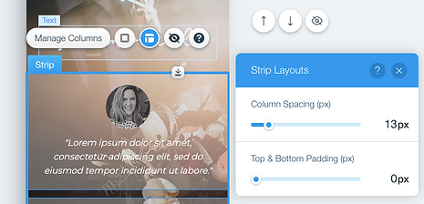
Change the Spacing of Columns
-
Click the relevant strip.
-
Click the Layouts icon .
-
Drag the Column Spacing slider to increase or decrease the gap between the columns, or enter a value.
-
Drag the Top & Bottom Padding slider to increase or decrease the space between the top and bottom of the strip, or enter a value.

Hiding & Unhiding Elements
Hiding an Element
-
Click the element in the mobile Editor.
-
Click the Hide Element icon.
Tip: You can also hide an element by pressing Delete on your keyboard.
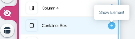
Unhiding an Element
-
Click Hidden Elements on the left side of the mobile Editor.
-
Click the Show Element icon on the right of the relevant element.

Adding a Back to Top Button
-
Click the Mobile Tools icon on the left side of the mobile Editor.
-
Click Back to Top Button.
-
Click Change Icon to start customising your button.

Customising the Back to Top Button on Your Mobile Site
-
Click your Back to Top Button in the mobile Editor.
-
Click Change Icon.
-
Select a preset icon or click the Add icon to choose from 1000’s of vector art images or upload your own.
-
Click Customise Design to make further changes.


Editing Text in the Mobile Editor
Changing the Size of Your Text
-
Click the text in the mobile Editor.
-
Click the Scale Up or Scale Down icons
Changing the Colour of the Text
-
Click the text in the mobile Editor.
-
Click the Settings icon.
-
Click the colour picker next to Colour to choose the colour of your text.
Changing the Text Alignment
-
Click the text in the mobile Editor.
-
Click the Settings icon .
-
Select an Alignment option:
-
Left alignment: The text is aligned to the left side of the text box.
-
Centre alignment: The text is centred in the middle of the text box.
-
Right alignment: The text is aligned to the right side of the text box.
-
Justified: This stretches your text across the width of the text box.
-

Changing the Layout of Your Mobile Social Bar
-
Click the Social Bar in the mobile Editor.
-
Click the Layouts icon.
-
Drag the slider under Icon size to increase or decrease the size of the icons.
-
Drag the slider under Spacing to increase or decrease the spacing between the icons.
-
Select a layout under How does the bar look?
-
Horizontal: The Social Bar is displayed horizontally.
-
Vertical: The Social Bar is displayed vertically.
-


Editing Your Lightbox
-
Click Menus & Pages on the left side of the Editor.
-
Click Lightboxes.
-
Click the relevant lightbox.
-
Edit your lighbox:
-
Click the Settings icon to update your lightbox page settings.
-
The Settings icon is only visible if in the Lightbox Settings in your desktop Editor you clicked Yes under Automatically display lightbox on pages.
-
Click the elements in your lightbox to customize, resize or hide them on your mobile site.
-
Click outside the lightbox to access the overlay, and then click the Settings icon to show or hide the overlay on your mobile site.
-
Click the 'X' icon to edit it using the available options.
-
Click the 'Close button' to edit it using the available options.
-


Customising Slideshows
Slideshow Size
-
Click the slideshow in the mobile Editor.
-
Click and drag the stretch handle to adjust the height and width.
Slideshow Settings
-
Click the slideshow in the mobile Editor.
-
Click the Settings icon.
-
Toggle autoplay on or off.
-
Apply a transition effect.
-
Choose to hide or show content outside of the frame.
-
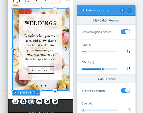
Slideshow Layout
-
Click the slideshow in the mobile Editor.
-
Click the Layouts icon.
-
Click the Show navigation arrows toggle on or off and drag the slider to adjust the size and offset.
-
Click the Slide Buttons toggle on or off and drag the slider to adjust the size, offset and spacing.
-
Note: Updating the order of the slides from the desktop Editor does not automatically update them for your mobile site. You can update the order of the slides for your mobile site by heading to the mobile Editor and hiding and then showing the slideshow.
Hiding and showing the slideshow resets the design. We recommend getting the slides into the correct order before adjusting the design.