The Basics
Pages
Menu
Background & Colours
Text
Images
Button
Container Box
Pro Gallery
Slideshow
Lines
Icons & Vector Art
Strips
Columns
Repeaters
Social
Lightboxes (Pop-ups)
Forms
Wix Plug-Ins
This guide will only discuss tools and elements that are used or featured in our templates. For the full range of features available with Wix please view this help article.
For demonstration purposes, I’ll be using one of our Wix Website Templates.
This guide will only discuss tools and elements that are used or featured in our templates. For the full range of features available with Wix please view this help article.

Accepting the Site Transfer
Site ownership can only be accepted in the Wix account associated with the email address that the site was transferred to. If you do not have a Wix account with this email address, you can create one.
To accept site ownership:
-
Check your email for an email with the subject line Wix Website is Being Transferred to You.
-
Click Accept Transfer in the email and sign in to your Wix account (if you are not already signed in).
Note: If you don't have an account, click Sign Up to create one. -
Review the transfer details and Complete Transfer.

Accessing the Site Dashboard
Your dashboard is the main base of operation for your site. From here you can manage all aspects of your site and business, including accessing the Wix Editor, editing your site settings, managing your contacts, settings up payment methods and more.
-
If you only have one site in your account, you are taken to your site’s dashboard as soon as you sign in. If you have more than one site, you’re directed to your site list.
-
Hover over the site you want to access and click Select Site.

Accessing the Wix Editor
The Wix Editor is the platform you use to build and edit your website.
-
To edit your site go to your site’s dashboard.
-
Click Edit Site in the dropdown menu

1
2
3
4
Using the Wix Editor
Before updating the website template it will be useful to familiarise yourself with the menus and tools that make up the Wix Editor.
There are 4 main menus/toolbars inside the Editor:
-
The left menu
-
The top bar menu
-
The right-click menu
-
The editor toolbar
The Left Menu

1

2
3

4
5
6
7
8

1
3
5
7

2
4
6
8
9
10
The menu on the left side of the Editor contains all the features you need to build your site:
-
Menus & Pages: From here you can add, delete and manage your site's pages.
-
Background: Use this panel to set the background of your site's pages.
-
Add: In this panel you will find tons of elements to add to your site. Use the tabs to navigate between the types of elements.
-
Theme Manager: From the Theme Manager, you can manage the text and color themes of your site in one place.
-
Add Apps: Browse hundreds of apps in the Wix App Market and find the ones that suit your needs.
-
Media: Add media files to your Media Manager or purchase professional images and videos to use on your site.
-
My Blog: Create a stunning blog and grow an online community with people who share your passion.
-
My Store: Wix Stores gives you all the tools you need to create a sleek, professional online store and grow your eComm business.
-
Bookings: Wix Bookings is an easy-to-use scheduling system that lets customers book services online, so you can focus on managing your business.
Depending on the template and plugins used on your website, additional icons may appear in the left menu.
The Top Menu
The menu bar at the top of the Editor contains several tools and settings.
-
Page drop-down: Navigate between your site's pages for editing.
-
Desktop and Mobile Editors: Switch between the desktop and mobile Editors.
-
Zoom Out & Reorder: Manage and reorder the sections on your page.
-
Undo: Undo your last action (Ctrl + Z)
-
Redo: Redo your last action (Ctrl + Y)
-
Save: Save your most recent changes.
-
Preview: Preview your site.
-
Publish: Publish your site/most recent changes.
The Right-Click Menu
-
Right-click any element in the Editor to open the right-click menu which contains several options and actions. Mac users should press control and click the mouse button.
The Editor Toolbar
The Editor Toolbar can be used it to easily edit the elements on your site.
-
Copy: Copy an element
-
Paste: Paste an element
-
Duplicate: Duplicate an element
-
Delete: Delete an element
-
Arrange: Move elements forwards or backwards
-
Align: Align elements
-
Distribute: Distribute multiple elements evenly
-
Match Size: Make multiple elements the same size
-
Rotation: Rotate elements
-
Size (px): Change the width and height of elements

Publishing Your Website
Publish your site every time you make changes so that they appear live.
-
Click Publish at the top right of the Editor.
-
(Optional) Click View Site to be taken to your live site.
-
Click Done.

Upgrading Your Site to Premium
With a Premium Plan, you can connect your own domain, remove Wix ads, get more storage and bandwidth, use Google Analytics, enjoy Premium support and more.

Page Structure
Your site pages are divided into three sections, which are defined by the gridlines in the Editor:
-
Header: Appears across the top of your site throughout all of your pages and usually contains your site menu and logo.
-
Page Body: Contains the bulk of your page's content and differs from page to page.
-
Footer: Appears across the bottom of your site throughout all of your site pages and usually contains your contact information, social icons and copyright information.


Navigating between the Site Pages
-
Click the Switch Page panel from the top menu in the Wix Editor.
-
Click the relevant page.
Connecting a Domain Purchased from Wix

Once you've purchased a domain from Wix, you can assign it to any Premium site in your account to connect it. Learn how to connect a domain purchased from somewhere else.
-
Go to the Domains page.
-
Do one of the following:
-
Assign a domain that is not currently assigned
-
Click Assign next to Not Assigned to a Site.
-
Select a site and click Next.
-
Click Assign.
-
-
Assign a domain that is already in use
-
Click the Show More icon next to the relevant domain and select Assign to a Different Site.
-
Select a site and click Next.
-
Select a site and click Next.
-
Click Assign.
-

Renaming a Page
-
Click Menus & Pages on the left side of the Editor.
-
Click the relevant page.
-
Click the Show More icon.
-
Click Rename.
-
Enter the new page name.
-
Click Done

Deleting a Page
-
Click Menus & Pages on the left side of the Editor.
-
Click the relevant page.
-
Click the Show More icon.
-
Click Delete.

Duplicating a Page
-
Click Menus & Pages on the left side of the Editor.
-
Click the relevant page.
-
Click the Show More icon.
-
Click Duplicate.
-
Enter the new page name.
-
Click Done.


Changing the Home Page
-
Click Menus & Pages on the left side of the Editor.
-
Click the relevant page.
-
Click the Show More icon.
-
Click Settings.
-
Click Set next to Make this your homepage?.
Customising the Menu Design


Customise the design of your menu, change the colours to match the look of your site or choose a new font size, style and more.
-
Click the menu in the Editor.
-
Click the Design icon.
-
Select a preset design or click Customise Design to customise your menu using the following options:
-
Fill Colour & Opacity
-
Border
-
Corners
-
Shadow
-
Text
-
Spacing
Note: You can have different designs for three menu item views; Regular, Hover and Clicked.
Fill Colour & Opacity
-
Click the Fill Colors & Opacity tab .
-
Drag the slider to change the opacity.
-
Click the color box to change the color.
-
Repeat the steps for the Hover and Clicked tabs.
Border
-
Click the Border tab.
-
Drag the slider to change the opacity.
-
Click the color box to change the color.
-
Drag the Width slider to change the border width.
-
Repeat the steps for the Hover and Clicked tabs.
Corners
-
Click the Corners tab.
-
Round the corners of your menu.
-
Round the corners of the dropdown menu.
-
Repeat the steps for the Hover and Clicked tabs.
Shadow
-
Click the Shadow tab.
-
Click the toggle to add a shadow.
-
Drag the slider to customise the following options:
-
Angle
-
Distance
-
Size
-
Blur
-
Opacity & Color
-
-
Repeat the steps for the Hover and Clicked tabs.
Text
-
Click the Text tab.
-
Customize your menu text using the options below.
-
Color
-
Theme
-
Font
-
Font size
-
Format
-
-
Repeat the steps for the Hover and Clicked tabs.
Notes: It is not possible to change the font size of the drop-down menu items without affecting the size of the main menu items.
Spacing
-
Click the Spacing tab .
-
Drag the slider to adjust the spacing at the bottom.
-
Drag the slider to adjust the spacing between items.
-
Repeat the steps for the Hover and Clicked tabs.
Adding a New Menu Item
There are several ways that you can add a new item to your site's menu. Click a link below to learn more.
-
Add a menu folder (a subpage menu where the menu item isn't clickable)


Add a new page
When you add a new page to your site, a new item is automatically added to your site menu. The new item has the name of the page.
-
Click Menus & Pages on the left side of the Editor.
-
Click Add Page at the bottom of the panel.
-
Enter the new page name.
-
Click Done.
Add a menu link
Add a link to your site menu such an email address, document or external URL. The link looks like a regular item on your site menu, but when your visitors click it, the link destination opens.
-
Click Menus & Pages on the left side of the Editor.
-
Click the Add a Link icon.
-
Select the link type and enter the link details.
-
Choose whether your link opens in a new window or the current window.
-
Click Done.
-
Enter the name for the menu item.
Add a Subpage Drop-down Menu
Place pages under other pages to create a subpage (drop-down) menu on your site. When the menu item at the top of the drop-down menu is clicked, the subpage menu opens.
-
Click Menus & Pages on the left side of the Editor.
-
Click the relevant page.
-
Click the Show More icon.
-
Click Subpage.
Add a Menu Folder
A menu folder is a subpage menu where the menu item at the top is not clickable.
-
Click Menus & Pages on the left side of the Editor.
-
Click the Add a Folder icon at the bottom.
-
Type the name for your folder and click Done. This text appears on your site menu.
-
Create the subpages for your folder:
-
Click a page that you want to become a subpage.
-
Drag it under the folder page.
Changing the Menu Text

Your menu item text is taken directly from your site's page names. When you change a page name, you can see the menu item text change instantly. If you have added a link to your menu, such as an anchor or external URL, you can change the menu item text by the following the steps below.
-
Click Menus & Pages on the left side of the Editor.
-
Hover over the relevant page/menu link.
-
Click the Show More icon.
-
Click Rename.
-
Type the new page name.
-
Click Done

Reordering Menu Items
-
Click Menus & Pages on the left side of the Editor.
-
Click and drag the menu items to a new position in the list.

Hiding a Page from the Menu
-
Click Menus & Pages on the left side of the Editor.
-
Click the relevant page.
-
Click the Show More icon .
-
Click Hide (or to unhide a page from your menu click Show)

Freezing the Menu to the Top of Your Site
You can set your header to remain on top of the page when your visitors scroll down. This allows your site visitors to easily access your site menu without scrolling back to the top.
-
Place your menu in your header.
-
Click the header.
-
Click the Settings icon.
-
Select Freezes.
Changing the Site Colours

Creating a colour theme is an important step in your site’s design process. When used consistently, these colours set the tone for your visitors and introduce them to your brand.
-
Click Theme Manager on the left side of the Editor.
-
Click Colours.
-
Click on a colour to change the colour or adjust the shade.
-
Select a new colour in one of the following ways:
-
Use the cursor to find and select a new color.
-
Enter the exact color in HEX, RGB or HSB values.
-
Use the sliders to change the Saturation and Brightness values.
-
-
Click Apply.

Changing the Page Colour
-
Click the relevant page in your Editor.
-
Click Background on the left side of the Editor.
-
Click Color.
-
Select a color from the Color Picker.
-
Click X to close the Color Picker.
Adding a Background Image

-
Click Background on the left side of the Editor.
-
Click Image.
-
Do one of the following:
-
Click Site Files and select a file that you already uploaded/added.
-
Click Upload Media to add an image from your computer, other Wix sites, social networks or from a URL.
-
Click Media from Wix, Unsplash and Shutterstock to choose from thousands of free and paid media.
-
-
Click Change Background.
-
Click Apply to Other Pages to add the background to other pages of your site.
Adding & Editing Text


Adding Text
-
Click Add on the left side of the Editor.
-
Click Text.
-
Click a text type:
-
Themed Text: These text elements have been handpicked for you as they match your template's look and feel.
-
Titles: These should be used for headings on your site to let your site visitors know what the pages or sections are about.
-
Paragraphs: These should be used for most of the text on your site. They should contain most of your site's content.
-
-
Drag a text element on to your page.
Editing Text
-
Click the text element in your Editor.
-
Click Edit Text.
-
Type your text in the text box.
-
Format your text using the options in the Text Settings panel as per the instructions below


Formatting the Text
Formatting helps you organise your text for clearer communication. Customise your text using the following options:
Font
-
Click the text element in your Editor.
-
Click Edit Text.
-
Click the Fonts drop-down menu.
-
Do one of the following:
-
Select a Wix font.
-
Click Upload Fonts to upload your own font.
-
Click Add Languages to add a language font.
-
Font Size
-
Click the text element in the Editor.
-
Click Edit Text.
-
Drag the Font size slider to increase or decrease the size of the text, or enter a specific value between 6 and 999 pixels.
Bold
-
Click the text element in the Editor.
-
Click Edit Text.
-
Click the Bold icon.
Italicize
-
Click the text element in the Editor.
-
Click Edit Text.
-
Click the Italics icon.
Underline
-
Click the text element in the Editor.
-
Click Edit Text.
-
Click the Underline icon.
Colour
-
Click the text element in the Editor.
-
Click Edit Text.
-
Click the Colour icon and select a colour.
Highlight
-
Click the text element in the Editor.
-
Click Edit Text.
-
Click the Highlight icon and select a colour.
Align
Align your text to the left, center or right, or justify it across the textbox.
-
Click the text element in the Editor.
-
Click Edit Text.
-
Click an alignment icon.
Bulleted & Numbered List
-
Click the text element in the Editor.
-
Click Edit Text.
-
Click the Bulleted List icon to add bullets.
-
Click the Numbered List icon to add numbers.
Character Spacing
-
Click the text element in the Editor.
-
Click Edit Text.
-
Click Character & Line Spacing and set the amount of space between the characters.
Line Spacing
-
Click the text element in the Editor.
-
Click Edit Text.
-
Click Character & Line Spacing and set the line spacing or select Automatic to automatically fill the text box.


Adding a Text Hyperlink
-
Click the text element.
-
Click Edit Text.
-
Highlight the relevant text.
-
Click the Link icon.
-
Select a link type.
-
Enter the link details.
-
Choose whether your link opens in a new window or the current window.
-
Click Done.

Uploading your Own Font
-
Click the text element in the Editor.
-
Click Edit Text.
-
Click the Fonts drop-down.
-
Click Upload Fonts to upload your own.
-
Click Done once the font has uploaded.
Working with Text Themes
Text themes are created to match your site. Create and save text themes to use again and again across your site. Your text themes are split into headings and paragraphs, and you can customise each of them individually. You can edit a theme and save the changes so that changes you make to a certain text theme affect all text elements that feature the theme saving you time so you don't need to update each element individually.


Editing a Text Theme
-
Click the Theme Manager icon on the left side of the Editor.
-
Click Text.
-
Hover over the relevant theme and click the Edit icon.
-
Customise the theme using the available options. You can change the font, colour and font size, and bold and italicise the text.
-
Click Apply to save your changes.
Applying a Theme to a Text Element
-
Select the relevant text box in your Editor.
-
Click Edit Text.
-
Click the Themes drop-down menu and select a theme.


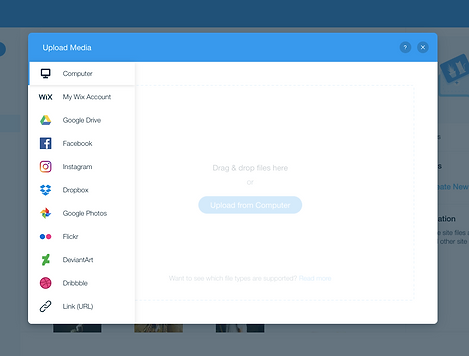
Uploading Your Own Images
Add your own images to your site to truly make it your own! You can upload images from your computer, social networks, your other Wix sites and using a URL.
Once you have uploaded them to the Media Manager you can use them anywhere on your site.
-
Click Add on the left side of the Editor.
-
Click Image.
-
Click My Image Uploads.
-
Click Upload Media.
-
Select where you want to add the media from:
-
Your computer:
-
Drag and drop files into the Media Manager or click Upload from Computer.
-
Select the files you want to upload.
-
Click Open.
-
-
Your other Wix sites:
-
Click My Wix Account.
-
Select the site folder.
-
Select the files you want to upload.
-
Click Upload Selection.
-
-
Social networks:
-
Select the social network.
-
Click Connect.
-
Select the files you want to upload.
-
Click Upload Selection.
-
-
A URL:
-
Click the Link iconon the left side.
-
Paste the URL link and click Import.
-
-

Changing an Image
-
Click the image.
-
Click Change Image.
-
Select a new image.
-
Click Choose Image.


Deleting an Image
-
Click the image in the Editor.
-
Press Delete on your keyboard.
Resizing an Image


-
Click the image.
-
Drag the resize handles on the edge of the image to the size you want.
-
Click the Settings icon.
-
Click the Keep proportions toggle:
-
Enabled: The image and shape stay at the original proportions when resized.
-
Disabled: The image and shape change proportions change according to the resize.
-
-
Click the Auto fill toggle:
-
Enabled: The image automatically adjusts to fill the space.
-
Disabled: The image does not automatically adjust to fill the space.
-

Cropping an Image
-
Click the image in the Editor.
-
Click the Crop icon.
-
Crop your image by doing the following:
-
Drag the crop handles to select the part of the image that you want to crop.
-
Move the crop window over the exact area you want to crop.
-
Drag the slider to zoom the image in and out, or enter a percentage value in the text field.
-
-
Click the Apply icon
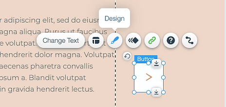


Customising the Button Design
Create beautiful, eye-catching buttons that match your site and attract your visitors to interact. There's endless design possibilities available, so get started and adjust to suit your needs.
Click the Design icon on your button to start customising using the following options:
-
Fills
-
Borders
-
Corners
-
Shadows
-
Layout
-
Text Formatting
-
Icon Design
Note: You can have different designs for three menu item views; Regular, Hover and Clicked.
Fills
Add different fills such as colors, images, patterns and gradients to create stunning and colorful effects on your button.
-
Click the Design icon on your button.
-
Click Customise Design.
-
Click the Fill Icon.
-
Click the colour box for each layer and choose the fill type, then drag the slider to change the opacity of the fill layer.
-
Fill layers can be reordered by dragging them up and down the list.
Borders
Customise the button's border to make it stand out. Customise all sides of the button together, or each side separately, by clicking the lock and unlock icon.
-
Click the Design icon on your button.
-
Click Customise Design.
-
Click the Border Icon.
-
Click the Width field and enter the pixel width, or adjust the slider.
-
Click the Style drop-down and select the border style.
-
Click the Fill colour box and select the border colour, and use the slider to adjust opacity.
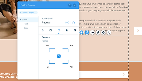
Corners
Change the corners of your button to make them more rounded or square. Change the size of all the corners together, or customise each corner separately, by clicking the lock and unlock icon.
-
Click the Design icon on your button.
-
Click Customise Design.
-
Click the Corners Icon.
-
Click the pixel field on a corner and enter the number of pixels you want to round the corner by.
Shadows
Add layers of shadows to your button, and customise the colour, size and more for each one.
-
Click the Design icon on your button.
-
Click Customise Design.
-
Click the Shadows Icon.
-
Click the colour box for each shadow layer and customise the colour, angle, size, distance, and blur.
-
Drag the slider to change the opacity of the shadow.
-
Reorder the shadow layers by dragging them up and down the list.
Layout
Add layers of shadows to your button, and customise the colour, size and more for each one.
-
Click the Design icon on your button.
-
Click Customise Design.
-
Click the Layout Icon.
-
Click the Choose what to show drop-down menu and choose if you want to display the text, icon or both.
-
Select the alignment, position and spacing of the text and/or icon (if relevant).
-
Set the padding around the text and/or icon.
Text Format
-
Click the Design icon on your button.
-
Click Customise Design.
-
Click the Text tab and format the button text.
Icon Design

-
Click the Design icon on your button.
-
Click Customise Design.
-
Click the Icon tab and customise the icon on your button with the following options:
- Show Icon: Click the toggle to show or hide the icon on your button.
- Size: Drag the slider to increase or decrease the size of your icon, or enter a value.
-
Colour: Click the colour box and select a colour.
Adding a Link to a Button

-
Click the button in your Editor.
-
Click the Link icon .
-
Select a link type.
-
Web Address: Link to an external URL.
-
Page: Link to a page on your website.
-
Anchor: Link to an anchor on your website.
-
Top/Bottom of Page: Link to the top or bottom of the page.
-
Document: Link to a document.
-
Email: Link to send an email to an email address.
-
Phone Number: Link to a phone number.
-
Lightbox: Link to a lightbox on your website.
-
-
Add the relevant link information.
-
Click Done.
Adding & Customising a Box

Adding a Box
-
Click Add on the left side of the Editor.
-
Click Box.
-
Click Container Boxes.
-
Drag a box element on to your page.
Note: You can attach almost anything to boxes and move them around your pages in one block of content.
Customising a Box

-
Click the Design icon.
-
Select a preset design or click Customise Design.
-
Customise your box using the following options:
-
Fill Colour & Opacity: Select the box's colours and opacity.
-
Drag the slider to change the opacity.
-
Click the colour box to change the colour.
-
Select a colour from the Colour Picker.
-
Click X to close the Colour Picker.
-
-
Borders: Design your box's borders.
-
Drag the slider to change the opacity.
-
Click the colour box to change the colour.
-
Drag the slider to change the width
-
-
Corners: Round your box's corners.
-
Shadow: Design a shadow for your box.
-
Spacing: Customise the box border spacing.
-

Attaching Elements to a Box
-
Re-size the box or element so that your element fits completely inside your box borders. The element needs to be smaller than the box.
-
Drag and drop the element into the box. The following message is displayed Attach to Box.
Note: You might need to move your box backward and your elements forward for them to appear on the box.
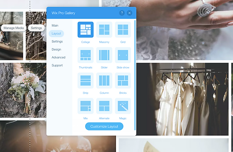
Adding Media to the Pro Gallery


-
Click the Pro Gallery in the Editor.
-
Click Manage Media.
-
Click Add Media.
-
Select the type of media you want to add and follow the relevant instructions below:
-
Image
-
Select the image from your Media Manager or click Upload Media to upload an image from your computer.
-
Click Add to Page.
-
Click Done.
-
-
Video
-
Select the video in your Media Manager or click Upload Media to upload a video from your computer.
-
Click Add to Page.
-
Click Done.
-
-

Changing the Spacing Between Images in the Wix Pro Gallery
-
Click the Wix Pro Gallery in the Editor.
-
Click Settings.
-
Click the Layout tab.
-
Choose a layout.
-
Click Customize Layout.
-
Scroll down to the Design Settings.
-
Drag the Spacing slider to increase or decrease the amount of spacing between images.


Changing the Layout of the Wix Pro Gallery
-
Click the Wix Pro Gallery in the Editor.
-
Click Settings.
-
Click the Layout tab.
-
Select a layout for your gallery.
-
Click Customize Layout to change the layout to look exactly as you want.

Choosing What Happens When a Gallery Item is Clicked
-
Click the Wix Pro Gallery in your Editor.
-
Click Settings.
-
Click the Settings tab.
-
Click the drop-down to choose what happens when you click an item.


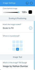
Customizing the Expand Mode for the Wix Pro Gallery
-
Click the Wix Pro Gallery in the Editor.
-
Click the Design tab.
-
Click Expand Mode.
-
Click Customize Expand Mode.
-
Customize the following settings on the right side of the pop-up:
-
Info Settings
-
What info is shown?: Select the checkboxes next to the info you want to display - title, description and link.
-
Where does it appear?: Choose where the info should appear - to the right of the image or under it.
-
When does it show?: Choose to keep info next to the image or hidden in an 'Show Info' icon.
-
-
Viewing Settings
-
Allow Full Screen: Click the toggle allow visitors to view full screen images from Expand Mode.
-
Loop Images: Click the toggle on to enable continuous scrolling.
-
-
Design Settings
-
Background Colour: Click the colour box to select the expand mode colour background.
Icon Colour: Click the colour box to select the icon colour. -
Title Style: Click the drop-down arrow to select a font style and click colour box to select a colour for the title.
-
Description Style: Click the drop-down arrow to select a font style and click colour box to select a colour for the description.
-
Text Alignment: Choose how you want the font and description texts to appear.
-
-


Customizing the Hover View of the Wix Pro Gallery Items
A visitor sees the hover view when placing the mouse over a gallery item without clicking. You can choose which elements appear on hover as well as how the hover looks.
-
Click the Wix Pro Gallery in the Editor.
-
Click Settings.
-
Click the Design tab to choose what hover elements you want to customise:
-
Overlay and icons
-
Colour overlay: Drag the slider to change the amount of colour overlay and click the colour box to choose a colour.
-
Icon colour: Click the colour box to select an icon colour.
-
Overlay effect: Choose an overlay effect from the options available.
-
-
Texts
-
Title style and colour: Select the font and colour of the title text.
-
Description font style and colour: Select the font and colour of the description text.
-
Horizontal alignment: Choose to align the horizontal text either on the left, in the centre, or on the right.
-
Vertical alignment: Choose to align the vertical text either on the left, in the centre, or on the right.
-
Text vertical padding: Drag the slider to change the amount of space between the vertical text and the border.
-
Text horizontal padding: Drag the slider to change the amount of space between the horizontal text and the border.
-
-
Item Style
-
Border width and colour: Drag the slider to change the border width and click the colour box to select a colour.
-
Corner radius: Drag the slider to make the corners more round or square.
-
Shadow: Click the toggle to enable or disable the shadow.
-
Choose what happens when someone hovers over the gallery item with their mouse.
-
Choose what happens while the image loads.
-
-

Reordering the Items in the Wix Pro Gallery
-
Click the Wix Pro Gallery in the Editor.
-
Click Manage Media.
-
Click and drag the gallery items into the order you want.
-
Click Done.
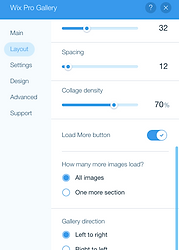
Enabling the Load More Button in the Wix Pro Gallery
-
Click the Wix Pro Gallery in the Editor.
-
Click Settings.
-
Click the Layout tab.
-
Click Customise Layout.
-
Click the Load More button toggle to enable it.
Select an option under How many more images load. -
Click the Design tab to customise the colours and fonts of the Load More button.

Adding a New Slide
-
Click your slideshow in the Editor.
-
Click Manage Slides.
-
Click Add New Slide.
Navigating Between Slides
-
Click the slideshow in your Editor.
-
Click the arrows to navigate between slides.


Adding a Background to the Slideshow
-
Click the slideshow in the Editor.
-
Navigate to the slide that you want to change the background of.
-
Click Change Slide Background.
-
Do one of the following:
-
Add an image or video
-
Click Image or Video.
-
Select a file from the Media Manager or click
-
Upload Media.
-
Click Change Background.
-
-
Change the background colour
-
Click Colour.
-
Select a colour from the Colour Picker, then click X to close the Colour Picker.
-
To modify your colour, click Settings.
-
Drag the Opacity & Fill Colour slider to increase or decrease the transparency of the background colour.
-
-

Changing the Slide Transitions on the Slideshow
-
Click the slideshow in the Editor.
-
Click the Settings icon .
-
Select a transition under Apply transition effects?:
-
Drag the How long do they last? slider to increase or decrease the transition time.
-
Click an option under Where do they start?
Managing the Slideshow Navigation Arrows
Showing or hiding the navigation arrows

-
Click the slideshow in the Editor.
-
Click the Layouts icon .
-
Click the Show navigation arrows and/or Show slide buttons toggle.
Customising the navigation arrows
-
Click the Design icon on the slides element.
-
Click the Fill Colour & Opacity tab.
-
Click the colour box next to Navigation Arrows.
-
Select a colour from the Colour Picker, then click X to close the Colour Picker.
-
Drag the Navigation Arrows slider to increase or decrease the opacity of the navigation arrows colour.


Managing the Slideshow Navigation Buttons
Showing or hiding the navigation buttons
-
Click the slideshow in the Editor.
-
Click the Layouts icon .
-
Click the Show slide buttons toggle to enable it.
-
Drag the sliders to customise the following:
-
Size: the size of the buttons, or enter a value in the text field.
-
Offset: the space between the buttons and the frame of the slideshow, or enter a value in the text field.
-
Spacing: the space between the circular buttons, or enter a value in the text field.
-
Customising the navigation buttons
-
Click the Slideshow in the Editor.
-
Click the Design icon on the slides element.
-
Click the Fill Colour & Opacity tab.
-
Click the colour box and drag the slider under Slide Buttons to change the colour and opacity.
Customising a Line Design
-
Click the line.
-
Click Change Design.
-
Click Customise Design.
-
Under Line Design, change the line colour and width.
-
In Customise Design you can change:
-
Borders: Select line colour and opacity.
-
Size: Increase/decrease the border width.
-
Spacing: Change the line spacing.
-


Changing the Size of Your Vector Art
-
Click the vector art in your Editor.
-
Click and drag one of the the resize handles on the edge of the vector art to the size you want.

Changing the Design of the Vector Art
Vector art images are digital illustrations or icons. They are created using vector illustration software, and bring life and colour to your site. Vector Art images are SVG files (Scalable Vector Graphics), which means you can resize your image without compromising its quality.
To change the design of your vector art:
-
Click the vector art in your Editor.
-
Click the Design icon .
-
Customise the design of your vector art using the options available. Some of the vector arts allow you to change each individual colour, and some allow you to change only one colour.

Adding a Colour to Your Strip Background
-
Click the strip in your Editor.
-
Click Change Strip Background.
-
Click Colour.
-
Select a colour from the Colour Picker.
-
Click X on the Colour Picker.

Adding an Image to Your Strip Background
-
Click the strip in your Editor.
-
Click Change Strip Background.
-
Click Image.
-
Select an image from the Media Manager.
-
Click Change Background.
Note: We advise you to upload the best image quality available. It is best if it is larger than 1920px by 1080px.

Adding a Video to Your Strip Background
-
Click the strip in your Editor.
-
Click Change Strip Background.
-
Click Video.
-
Select a video from the Media Manager or click
-
Upload Videos to upload your own.
-
Click Change Background.

Changing the Image Scaling and Position on a Strip
-
Select the image on the strip.
-
Click Change Strip Background.
-
Click Settings.
-
Scroll down to Scaling & Positioning.
-
Click the How's the image scaled? drop-down and select an option.
-
Select a position for your image under Where is it positioned?. This is helpful if your image is not centred or is focused on the wrong area.

Adding a Background Scroll Effect to Your Strip
Add a scroll effect to create a sense of movement in your strip as visitors scroll down. You can choose from a variety of effects that make your strip look more dynamic, whether you're using a colour, image or video for the background.
-
To add a background scroll effect:
-
Click the strip in the Editor.
-
Click the Background Scroll Effects icon .
-
Select a scroll effect.
-
Preview your site to see the scroll effects in action.
Add, Delete & Duplicate Columns
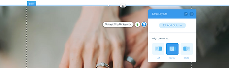


Split a Strip into Two Columns
-
Click the strip element in the Editor.
-
Click the Layouts icon.
-
Click Add Column.
Add More Columns to a Strip
-
Click the strip (with at least two columns) in the Editor.
-
Click Manage Columns.
-
Click Add Column.
Deleting a Column in a Strip
-
Click the strip with the columns in the Editor.
-
Click Manage Columns.
-
Click a column under Pick a column.
-
Click the Delete icon.
Duplicating a Column in a Strip
-
Click the strip with the columns in the Editor.
-
Click Manage Columns.
-
Click a column under Pick a column.
-
Click the Duplicate icon.

Changing the Column Spacing
-
Click your strip that contains the columns in the Editor.
-
Click the Layouts icon .
-
Drag the Column Spacing slider to increase or decrease the gap between each column, or enter a value.
-
Drag the Padding slider to increase or decrease the space between the columns and the edge of the strip, or enter a value.
Resizing Your Columns
-
Click the strip that contains the columns in the Editor.
-
Click the Layouts icon .
-
Click a layout under Column Proportions.
-
Click Customise Proportions and customise the layout by dragging the column edges.


Changing the Background of Your Columns
-
Click the column on the strip in the Editor.
-
Click Change Column Background.
-
Click a background type:
-
Colour: Select a colour from the Colour Picker, then click X to close it.
-
Image: Select your own image or one from Wix or Shutterstock.
-
Video: Select your own video or one from Wix.
-
-
Click Settings to change the background settings.

Changing the Order of Columns in a Strip
-
Click the strip that contains the columns in the Editor.
-
Click Manage Columns.
-
Click a column under Pick a column.
-
Click the Move left or Move right icons.


Add, Delete & Duplicate Repeaters
Adding More Items to a Repeater
-
Select the repeater in your Editor.
-
Click Manage Items.
-
Click Duplicate Item at the bottom.
-
Edit your new item as you wish.
Delete a Repeater Item
-
Click the repeater in your Editor.
-
Click Manage Items.
-
Click the Show More icon.
-
Click Delete.
Duplicate a Repeater Item
-
Click the repeater in your Editor.
-
Click Manage Items.
-
Click the Show More icon by the item you want to duplicate.
-
Click Duplicate.
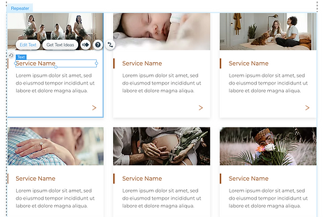
Editing a Repeater Item
All the items in the repeater have the same design. You can customise the individual elements inside an item such as the text and images, but the design always stays the same. To design an element, select it and click the Design icon.
When you add an element to a repeater item, it is automatically added to every item to keep the design consistent. The item size will change to adjust to the content inside.


Managing your Social Bar & Social Icons
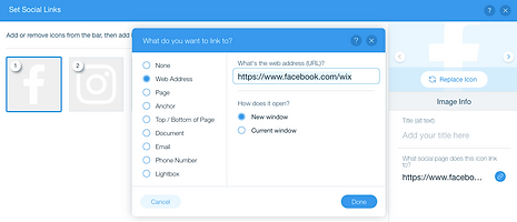
Adding a Social Icon to Your Social Bar
-
Click the Social Bar in the Editor.
-
Click Set Social Links.
-
Click Add Icons.
-
Select one of the available social icons, or click Upload Images to upload a new icon.
-
Click Add Icons.
-
Click the link field on the right side.
-
Select Web Address from the list.
-
Enter the relevant URL (this should be your social URL, e.g. http://www.facebook.com/wix).
-
Select New Window or Current Window under How does it open?
-
Click Done.
Reordering Icons in Your Social Bar
-
Click the Social Bar element.
-
Click Set Social Links.
-
Click on the icon and drag it to the relevant location.
-
Repeat Step 3 for all relevant icons.
-
Click Done.
Deleting an Icon from Your Social Bar
-
Click the Social Bar element.
-
Click Set Social Links.
-
Hover over the relevant icon.
-
Click the Delete icon.
-
Click Done.
Replacing an Icon in Your Social Bar
-
Click the Social Bar element.
-
Click Set Social Links.
-
Click an icon.
-
Click Replace Icon on the right.
-
Select one of the available social icons, or click Upload Images to upload a new icon.
-
Click Choose Image.
-
Click the link field on the right.
-
Select Web Address from the list.
-
Enter the relevant URL (this should be your social URL, e.g. http://www.facebook.com/wix).
-
Select New Window or Current Window under How does it open?.
-
Click Done.

Customising a Layout for Your Social Bar
-
Click the Social Bar element.
-
Click the Layouts icon .
-
Customise your layout by using the following options:
-
Changing the Social Bar layout: Select Horizontal or Vertical under How does the bar look?.
-
Changing the size of your Social Bar icons: Drag the slider under Icon size to increase or decrease the size of the icons, or enter a value directly in the box.
-
Changing the space between your Social Bar icons: Drag the slider under Spacing to increase or decrease the spacing, or enter a value directly in the box.
-

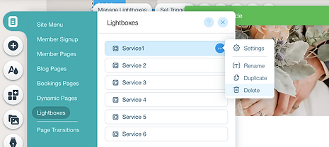
Accessing Your Lightbox for Editing
-
Click Menus & Pages on the left side of the Editor.
-
Click Lightboxes.
-
Select the lightbox you want to view.
Deleting a Lightbox
-
Click Menus & Pages on the left side of the Editor.
-
Click Lightboxes.
-
Click the Show More icon beside the lightbox you want to delete.
-
Click Delete.

Linking to a Lightbox
-
Go to the element that you want to link from and:
-
Click the Link icon to add a link to that element.
-
Select Lightbox.
-
Click the Which Lightbox? drop-down menu and select the relevant lightbox.
-
Click Done.
Managing Form Fields


Add a New Form Field
-
Click the form in the Editor.
-
Click the Add Element icon.
-
Select a category.
-
Click the Add icon to add a field.
Edit a Form Field
-
Click the form in the Editor.
-
Click the field you want to set up.
-
Click Edit Field and set up the field using the following options:
-
Show Field Title: Click the toggle to show or hide the selected title in the field.
-
Field Title: Enter the field title as it appears to your visitors.
-
Show initial text: Show or hide placeholder to prompt your visitors.
-
The field is: Select or deselect if the field is required to be filled before form submission.
-
Checked by default: Checkboxes can be set to be empty or pre-checked.
-
Set Character Limit: Set a limit for the amount of text a user can fill inside of the field
-
Delete a Form Field
-
Click the form in the Editor.
-
Click the field you want to delete.
-
Press delete or backspace on your keyboard.
Customising the Design of Your Form

Customise the Design of a Form Fields
-
Click your form in the Editor.
-
Click the Design icon.
-
Click Customise Design to design it further.
-
Click the state drop-down menu and select which one you want to customise; Regular, Hover, Focus or Error.
-
Customise the state using the options:
-
Fill Colour & Opacity: Customise the background colour of your fields.
-
Border: Add and customise a border for your field.
-
Corners: Curve the corners of your fields.
-
Shadow: Add a shadow to your fields.
-
Text: Format the field title and input text.
-
Designing Your Form Background


-
Click your form in the Editor.
-
Click the Design icon.
-
Click Customise Design to design it further.
-
Click the Form Background tab.
-
Customise the state using the options:
-
Fill Colour & Opacity: Customise the background colour of your fields.
-
Border: Add or customise a border.
-
Corners: Curve the corners of your fields.
-
Shadow: Add a shadow to your fields.
-


Receiving Email Notifications for Form Submissions
-
Click the form in the Editor.
-
Click Form Settings.
-
Click the Settings tab.
-
You send the notification to 2 email addresses, however these addresses must either belong to you (the email address associated with your Wix account) or a contributor email address.
Note: If the email address you want to send to does not belong to you or a contributor, first add it here.